A font for better forms design

The purpose of this font is to serve form designers while making them more legible, thus helping potential users.
With Lea Ágreda, we have noticed that the forms we analyzed were not user friendly but confusing, with chaotic structures.
For this reason we aim to solve these problems by designing a typography that can survive and live with extra typographic elements, thus improving multiple reading levels.
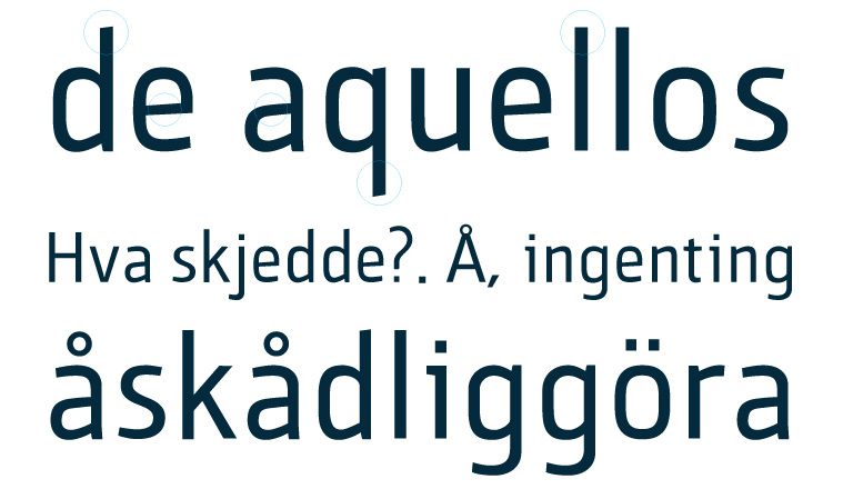
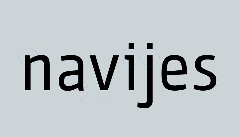
We wanted to use custom terminals to differentiate ambiguous characters. But sometimes marking such difference was detrimental to a font family. This caused us some color and size related issues.
To slightly differentiate the external curve from the interior curve is useful to solve some stroke and structure related problems.


