Capture the essence of the defined target
The Directors to the Higher Education School of Cinematography Film College, Mauricio Diaz and Pía Suarez, needed an institutional brochure focused on their marketing and brand positioning strategy –on which I collaborated– to hand it over at the largest exhibition on Higher Education in Latin America, Expouniversidad. The brochure was intended to inform potential students of the advantages of cinematography training and attending the institution.
As a way to anticipate the context where ExpoUniversidad would be held, with more than 1,900 exhibitors and 70,000 attendees in three cities (Buenos Aires, Bogotá and Caracas), the visual noise issue was dealt with. The purpose was to attract people’s attention, overcoming the barriers they unconsciously create when encountering too much advertising in their fields of vision.
I was able to highlight human touch and the wide choice for the in-person training sessions. I was able to effectively mark course differences and to position the institution using a young, fresh and modern image. I was also able to provide information on the new online courses of studies on their brand new web campus.
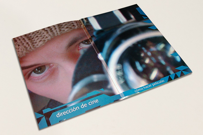
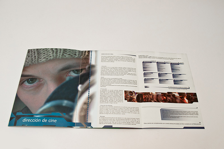
To meet the objectives, a complex folded piece with two types or levels of reading was prepared to facilitate attention and access to information. A concept, communicational and visual strategy was developed for the first reading level, using carefully selected photographic resources to convey the spirit of each course of studies. To do this, I used a very expressive language, appealing in terms of colors and morphology, which allowed me to highlight the courses offered by this Higher Education School.


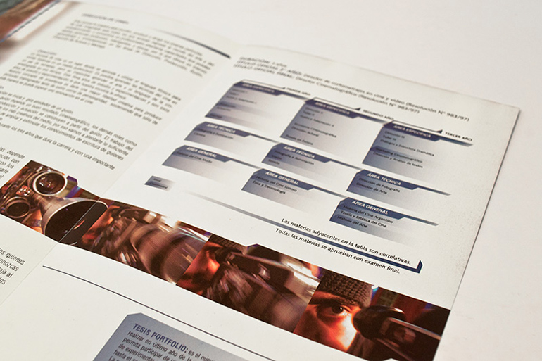
A second organized reading level enabled to access the information on the institution’s courses of studies in a minimum reading time. The brochure structure was graphically treated so to renew its image while facilitating information distribution.
With this visual language, it was possible to capture the essence of the defined target. Thus, apart from referring to each course of studies, it was possible to add the Higher Education School values that had not been included in the regular program of the previous printed material.
I harmoniously included a system of dingbats in the editorial layout, using the Internet and technology for the courses of studies, thus helping to create a context for the intended brand repositioning.
To differentiate reading times, I created a tailored-made complex brochure structure with multiple folds to include specific areas and achieve a controlled interaction with the reader. The piece was effective and my client’s original expectations were surpassed. The demand for the piece was high and it had to be reprinted during the school year.