Special equipment to transport and storage of industrial materials
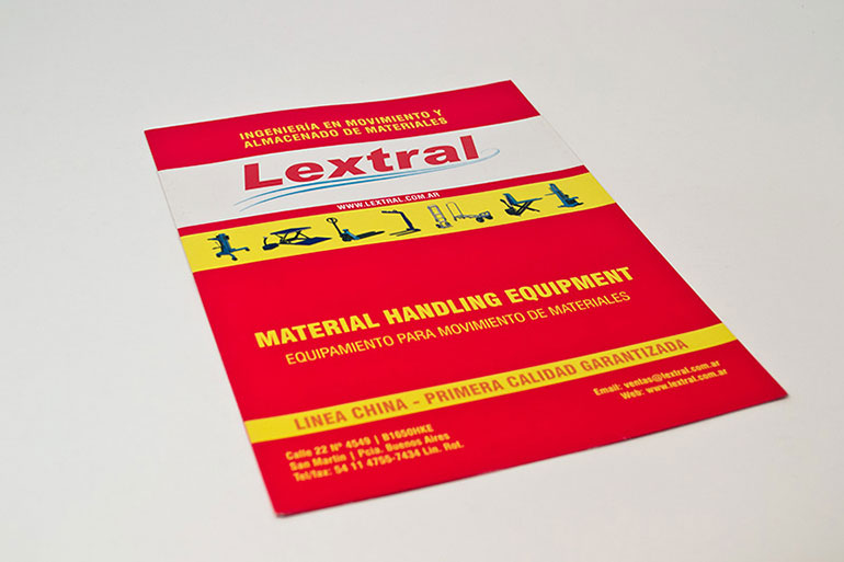
Lextral S.R.L. is an Argentine company that has operated more than 50 years in the market, designing and manufacturing special equipment to transport and storage industrial materials such as hydraulic platforms, graders, transportation of barrels and furniture for factories. It is a representative of Paletrans, the largest pallet truck company in Latin America and the largest manufacturer of hydraulic staking machine worldwide.
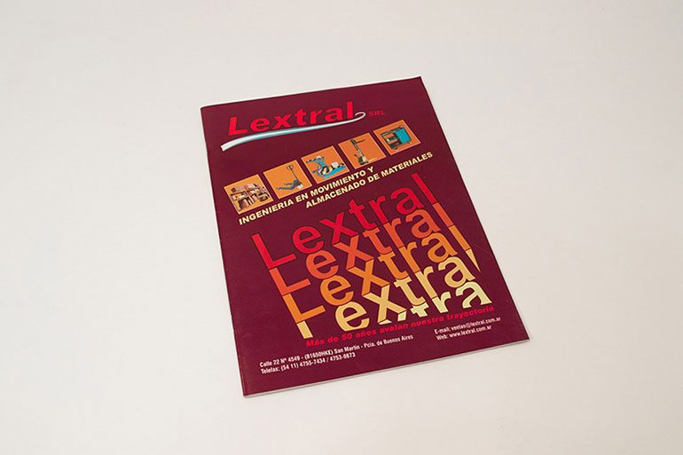
Design of a catalog showing all its industrial production, systemized and organized so that the technical contents of each product are easily found and understood to be used as an editorial piece for sale and consultation.
The challenged posed by the pragmatic Engineer Giraudi, President of Lextral, was to produce an inexpensive editorial piece as a tool to organize and systemize the search of highly technical products and industrial pieces, facilitating functionality for both customers and sellers, in the least amount of folds possible and with an extremely tight deadline prior to their presentation at the international exhibition EMAQ (International Machine Tool, Tools & Tooling Equipment Exhibition).


I designed the editorial layout, using a very versatile grid. I was in charge of the typographic work, facing difficulties to keep so much information and codes legible in the printings that had been quoted. I also led the team that completed the catalog, thus meeting our client’s needs of having the least number of folds possible.
To meet the deadline, I had to plan a work schedule for graphic designers to work in shifts and on a rolling basis, in sync with the ongoing projects, thus avoiding the accumulation of extra hours and staff tiredness.


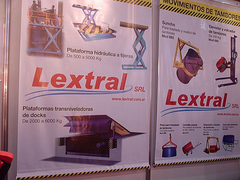
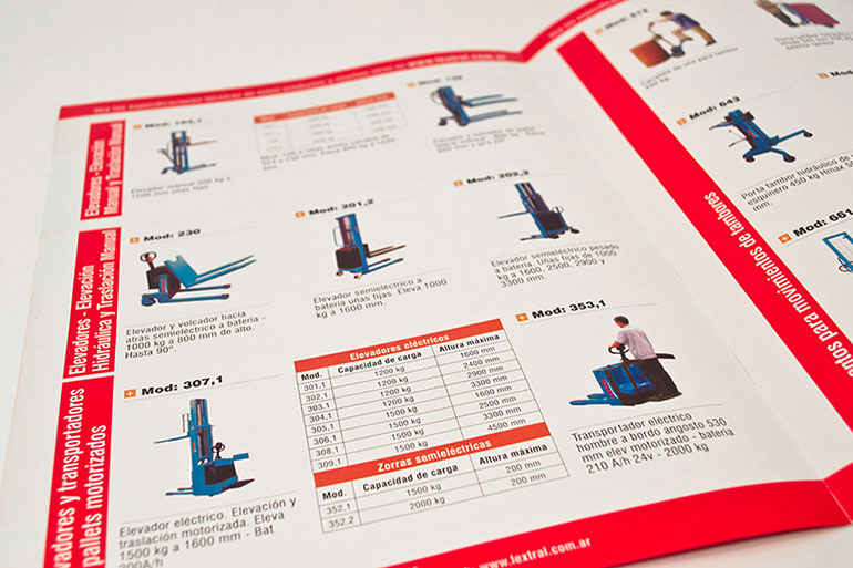
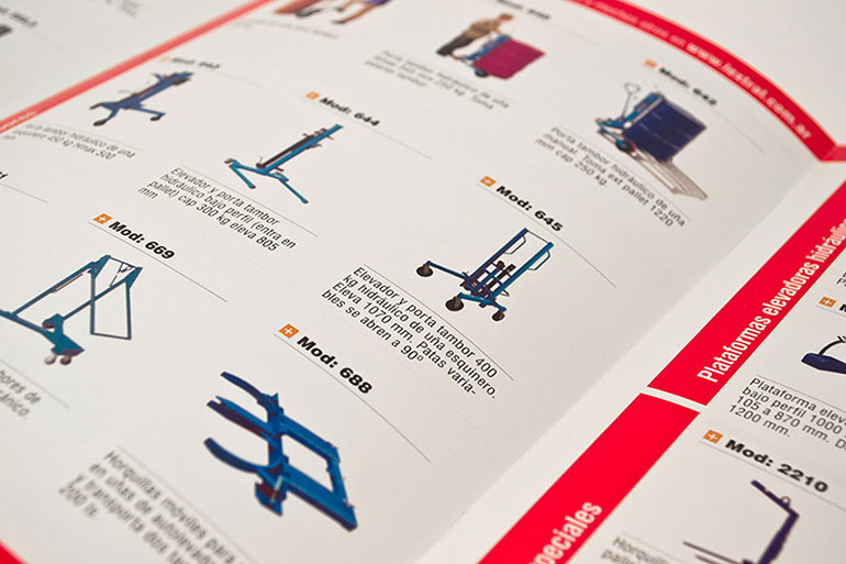
In just a few days, based on very accurate technical information of almost 5000 products, we prepared more than 300 original images suit for printing. The fact of having updated digital photography equipment made it possible to optimize the so little time available for production to introduce the new products that Lextral displayed at the international exhibition EMAQ. All those product pictures had to keep the same visual criteria.
I performed a complete organization and classification of the entire product offer according to their use and functions. This systematic approach enabled optimal information legibility and a simpler search of any products by Lextral. The complete chromatic spectrum allowed me to organize product groups by family and type and to create a color code to easily identify the whole product line.
I supervised the entire production process, working together with the printing house and meeting the deadline.


All the products that the production and sales departments had were presented in a systematic and complete way in this editorial piece, which was supervised and updated. This catalog was the basis to publish the products on the website in a systemized way.
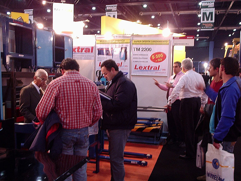
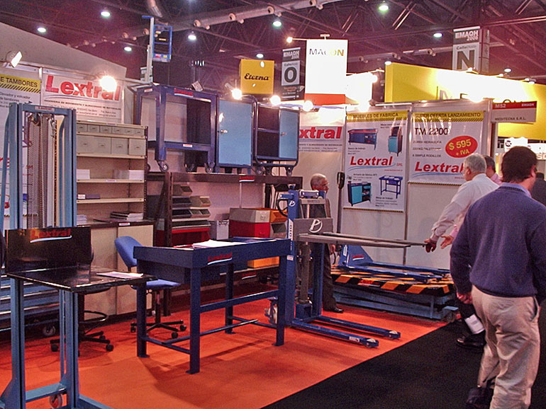
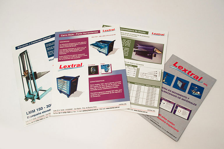
A couple of years later, with a larger schedule, we made a new version of this product catalog, known in the industry as “Lextral catalog” since it was the company’s printed search tool par excellence. This time, the company asked me to highlight new products in two brochures as inserts, in line with the visual language and product photography style. I also made a series of posters for their stands and showroom at their industrial plant in San Martín, Buenos Aires.
Then in order to reduce printing costs, I was charged with the task of designing a three-fold brochure containing only the flagship products produced by Lextral S.R.L., highlighting them among the other 7000 products contained in the traditional Lextral catalog used at that time.
The industry needs vary a lot according to the sector, size and type of industrial work of each client, so a smaller but equally detailed brochure was required without having to include all the products.
With colorful Pantone colors in line with the chromatic pallet used by the company, about 40 major products of each category were highlighted. The three-fold brochure format enabled a large circulation at a cost lower than that of the catalog, better paper and printed quality and, most importantly, more vital blank space.
For this piece, I also chose to follow the same visual language and product photography style.